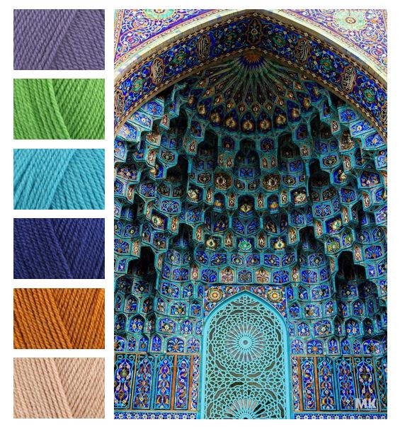
I think I fell in love all over again! This is the St Petersburg Mosque in Russia. I love how the each of the colors pop out at you regardless of how little some of them are used The tiny touches of gold and green blend perfectly with the more predominant blues and turquoise.
I tried to match the colors as close to as possible using Stylecraft Special DK yarn.
– Violet
– Grass Green
– Turquoise
– Lobelia
– Gold
– Stone
Would love to hear what your thoughts on patterns that would suit these vibrant colors. Or if you have tried them before!
Happy Crocheting


I love this-I saw it on the Bella Coco fb group and thought you did a great job colour matching. 😊
LikeLike
Thank You. Picking colors isn’t an easy task for me but I find mood boards help alot.
LikeLiked by 1 person
This is perfect! I’ve been trying to make a new colorway for my Persian Tiles pattern by Jane Crowfoot. Using this as inspiration, I think I’m going to invert her traditional colors to make teal and green the star (instead of red and orange). The only problem is, I need a 7th color — it’s only used in 2 rows (replacement for the yellow). Anyone have any suggestions?
LikeLike
How about Apricot to go with the Stone and Gold, or Cream/Parchment
LikeLike